
A 5-month product design project, working in a large team to expand an existing rewards scheme & integrate the offer into a mobile app.
Confused.com Rewards: Improving retention by optimising a marketing proposition
Product design project

Project type
As part of my role as a product designer at Confused.com.
My role
Product designer, in a team of two designers.
Tools
Figma, Miro, UserZoom
Duration
Project completed between June 2022- Oct 2022
Where did we start?
When the project started, Confused.com Rewards was a simple offer:
Choose a reward when you buy car, home or van insurance with Confused.com.
The user could return to Confused.com after buying their insurance to select 1 of 4 rewards, worth £20. After completing a claim form they would be emailed a voucher, which could be redeemed with their chosen retailer.

The problem
After buying car or home insurance, only 25% of our users return to buy with Confused.com the following year.
However, 34% of users that redeem a reward return to buy the following year.
The problem:
Improve the offer & the redemption process to encourage more users to claim a reward.
Increase the 34% retention rate by improving Confused.com Rewards.
Integrate rewards into the Confused.com App.
The task:
Research & discovery
What we did:
Data analysis, to understand what we know about the current offer
Competitor research, ground our offer against our competitors and other reward schemes in the market
User research, learn more about our users and their experience claiming a reward
UX analysis of the end-to-end user journey
What we found:
1 of our 4 existing rewards, 12 free car washes – supplied monthly, had a 52% retention rate, leading to some key ideas.
Our offer was truly free, not 2-4-1 or similar. This set us apart.
A choice of rewards was key & it set us apart. We can’t remove choice.
Some rewards were more difficult to redeem than others, causing frustration.
The solution
Introduce a new app-only monthly reward to keep users engaged for their entire insurance term.
Overhaul the offer & redemption process to encourage more users to redeem a reward.
Improving the redemption process
Before designing the new monthly reward, we needed to improve the redemption process of our current offer. We analysed the journey and found:
Offering four rewards meant four different journeys. Some rewards were more difficult to redeem than others. This caused a disproportionate amount of customer queries.
The rewards tracker, used to check the status of your rewards, was inaccurate. This page had a very high bounce rate.
Users were often unaware of restrictions applicable to each reward, leading to a lot of frustration after the rewards has been redeemed.
With a better idea of the problems we had to solve, we then moved on to wire-framing.
The user flow shows the difference in effort across the 4 reward redemption processes
Developing the claim journey
Our development of the claim journey was key. We needed to introduce the new offer, explain how it worked and ensure all users knew how and when they could claim both the main reward and the monthly reward.
What we did to improve the claims process:
Broke the claim process into manageable sections to reduce cognitive load.
Improved content in the claim form with helpful tips and more accurate error messaging.
Added specific tracker states per reward, no longer using generic language across all rewards.
Introduced the monthly reward and reminded users how and when to redeem it.
Included the monthly reward in the tracker so the user could track everything in one place.
Product colours allowed us to differentiate a car insurance reward, in blue, and a home insurance reward, in green.
The existing design for the claiming process and the new design.
Tracking the new monthly reward
The new monthly reward meant a user had two active rewards each time they bought car, home or van insurance.
Allowing a user to track all of their rewards in one place was particularly important. So we focused on improving the tracker in the user’s web account and within the app itself.
We tested our mid-fidelity wireframes and found that we needed to differentiate the main reward from the regular reward. But would need to group both rewards within each claim to make it clear they were linked.
We introduced tracker states that were personalised to each individual reward, with over 80 states in total.
Development of the tracker states
Creating the app journey
Working alongside our app designer, we planned the app flow. We kept the flow very simple, with just 3 steps from home screen to the QR code used to get the monthly reward.
We wanted the app to showcase to our users a cumulative view of all of the rewards they’ve received from us throughout the year. We opted for a calendar grid to show the redemption of each monthly reward.
During testing we discovered that the web tracker cards did not convert exactly into the app as the focus was to redeem the regular reward. Users also found the app experience to be uninspiring, so we introduced imagery to enhance the app screens.
Through a combination of push notifications and emails, we also planned how and when reminders would be sent to the user to tell them their monthly reward was ready to redeem.
First wireframes through to the final designs. Allowing the user to redeem and track their monthly reward.
Final designs

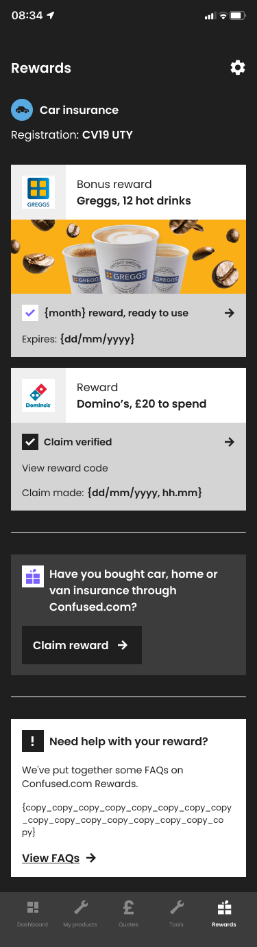
App screens: Calendar tiles to show monthly redemption & the rewards tracker within the app.


Emails: An example of the monthly reward reminder email and the main reward redemption email.
Rewards landing page during testing monthly reward testing period.
Web tracker: Web tracker & promotion of the new monthly reward.
Tracked results
Renewal rates
Tracking to be +25% vs a user that didn’t claim either reward
Tracking to be +13% vs a user that claimed just the standard reward
Monthly active users
Trebled monthly active users over the first 6 months
App downloads
App downloads up around 22% YoY for the first 6 months after launch