
Creating Rewards+
Product design project
As a product designer, few things are as rewarding as seeing a project you've poured your heart into make a real impact. I recently had the incredible opportunity to lead the design of Rewards+, Confused.com's brand-new flagship marketing scheme.
This wasn't just about a fresh coat of paint; I stepped beyond my core responsibilities to help rethink how we can use a loyalty scheme to drive significant shifts in acquisition, retention, and product density.

Project type
As part of my role as a Senior Product Designer at Confused.com.
My role
Product designer. Responsible for UI design, UX research and content design.
Tools
Figma, Miro, Usertesting.com
Duration
Project completed between November 2024- March 2025
Project overview
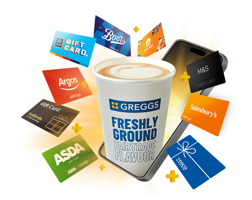
For the past 5 years, Confused.com has offered incentives to customers who purchase car, home, or van insurance. Our previous scheme gave users a choice of one of four rewards. We even introduced a monthly treat – a hot drink from Greggs – which was a hit, significantly boosting retention.
However, there was a catch… only 15% of our customers actually redeemed a reward. This meant we weren't fully leveraging the retention power of our monthly treat. We knew we could do better.
The challenge:
Within 18 months, create a new marketing proposition that would make Confused.com the go-to platform for insurance, driving a meaningful shift in acquisition, retention, and product density (customers buying more products from us).
My mission:
Learn from the best
We kicked off with an deep dive into the world of loyalty.
This wasn't limited to just our direct competitors; we cast our net wide, analysing 34 different brands from Tesco to Octopus. We conducted a detailed SWOT analysis to understand their strengths, weaknesses, opportunities, and threats.
What did we learn from these successful loyalty schemes?
Offer both short and long-term value:
The most effective schemes, like Tesco Clubcard, offer an immediate, "no-brainer" incentive to join, followed by longer-term benefits that encourage repeat purchases.
Include a sense of progression:
Schemes that show customers they're moving up, like Tesco Clubcard's personalised rewards that increase with spend, create a powerful sense of achievement and encourage continued engagement.
Personalisation is key:
Asda Rewards excels at this, sending personalised CRM campaigns that highlight a user's shopping habits and "achievements."
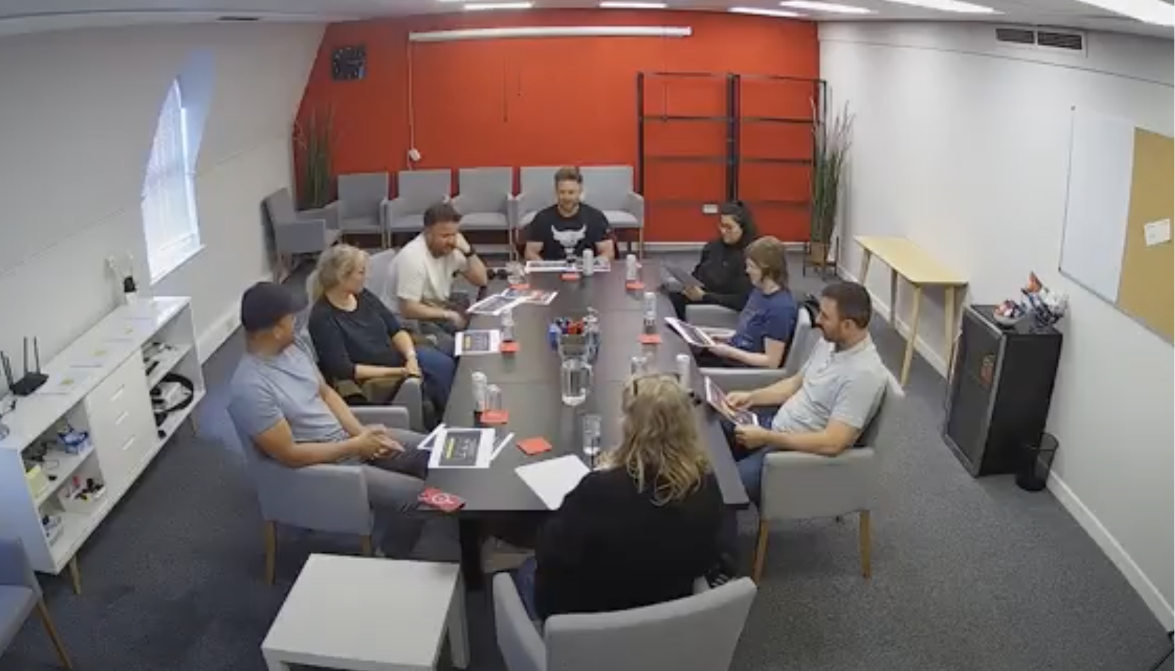
We then brought together cross-functional squads from across the business – ensuring a diverse range of perspectives beyond just marketing and design. We held three separate ideation sessions, starting each by revisiting our competitor research & outlining what we’ve learned from our current rewards scheme.
We ended up with over 50 unique, "blue-sky" ideas. The next challenge? How to refine these and determine their viability for our users and our business.
Thinking big

Refining the vision
My Product Manager and I took on the task of sifting through these ideas. We scored each one out of 10 against four critical categories:
Does this idea deliver customer value?
Does this idea deliver business value?
Is this idea technically feasible?
Is this idea viable for our business? (Considering brand alignment and potential cost.)
This rigorous scoring allowed us to filter out less promising ideas and highlight areas that needed further exploration. As our research progressed, we continuously updated these scores – for example, adjusting technical feasibility scores after our technical discovery sessions.
We then plotted the reduced number of ideas against their potential impact on acquisition, retention, or product density, ensuring we stayed aligned with our core brief. This process narrowed our 50+ ideas down to a focused six.

Planning for discovery
With our top six ideas, it was time to plan our discovery phase. For each idea, we designed a tailored approach to gather more insights and improve the accuracy of our scoring.
Here's an example of how we approached discovery for the idea we ended up progressing with:
Technical feasibility: We ran workshops with our technical leads to identify any immediate implementation challenges.
Customer value: We conducted three focus groups, speaking directly to our users to understand their needs and preferences. Directly testing the appeal of the idea.
Business value: We launched quantitative surveys to gauge mass appeal and inform the design of the offer.
Business viability: We initiated light-touch forecasting to estimate potential costs.
Our technical discovery revealed that two of the six ideas would require significant infrastructure changes, leading us to remove them from consideration. This left us with four promising ideas, ready for further research.

User insights
We ran three focus groups to test our four remaining ideas. I created two branded mock-ups for each idea, making them feel like real offers. This allowed us to not only test the offer's appeal but also learn how to communicate it most effectively visually.
The clear winner was a tiered, multi-product reward system offering increasing values with repeat purchases and access to an almost unlimited range of brands.
Here's what users loved about it:
150+ retailers: "It's like cash." This breadth of choice was a huge draw.
Increasing values: "I would deliberately shop there if I knew I was going to get more back." This directly supported our retention goals.
Ease of understanding: "I much prefer this, there's no thinking involved." Simplicity was key.
However, we also uncovered areas for improvement:
Tier confusion: Users expected more from a tiered scheme ("The tiers are meaningless without something else included... I'd expect savings as well like Booking.com").


Example of the conversation stimulus shown during focus groups
Quantifying appeal: Our survey says...
Our quantitative research, conducted through surveys, further validated the mass appeal of our tiered offer. However, the survey also highlighted some concerns:
Difficulty progressing: Users worried about not using our service frequently enough to earn "decent" rewards, indicating a need to refine the perceived effort required to advance through tiers.
Trust issues: Some still felt the offer "sounds too good to be true," reinforcing the need for clear and trustworthy communication.
We also explored which brands resonated most with users for reward redemption, informing our selection of retail partners.
Shaping the identity
My next task was to find the perfect name and visual style for the offer. We used UserTesting.com to test numerous ideas.
Crucially, our research revealed that branding the offer as "tiered" carried negative connotations for users. We needed to convey simplicity and immediate value. We also needed to brand the offer in a way which built upon the symbolic capital ‘Confused.com Rewards’ had built over the last 5 years.
Our research consistently showed that we needed to emphasise the vast range of brands available for redemption. This was a key differentiator.
This lead us to a simple name, Rewards+, and a visual style which conveyed the huge range of brands available. Plus a tagline: “Get rewards you’ll actually use, every time.“
Confused.com Rewards+
Unused branding ideas
Each idea aimed to encapsulate Confused.com’s brand ethos, the lifting feeling that comes with ticking insurance off your to-do list.
However, our research revealed that these ideas focused too much on future progression and not enough on the here and now. Users cared more about the reward they’ll get now, not what they’ll get next year. We made the strategic decision to communicate the increased reward values when they user has reached them, rather than shouting about it upfront.


Crafting the UX
I worked hand-in-hand with our gift card partner to understand the technical constraints of the offer. This allowed me to plan out the user flow, communicating with stakeholders at every step. I created detailed wireframes to map out the journey, which we then tested with users on UserTesting.com. This revealed several content-related issues that needed refining.
Working with our brand designers, we visually tied the offer into the Confused.com brand, ensuring a seamless and intuitive experience. We also meticulously planned the marketing materials, understanding that a phased launch to a subset of users meant we could only promote the offer in specific channels, primarily email and within the quote process.
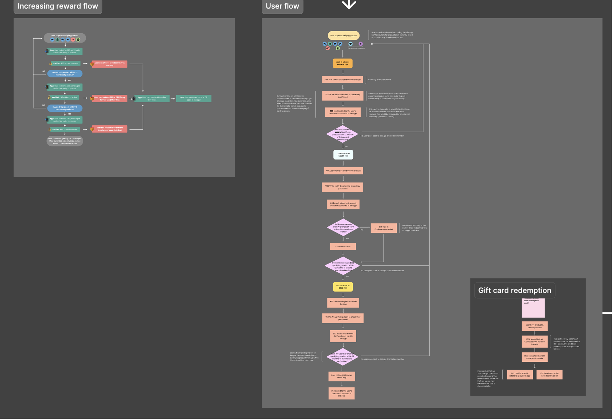

An example of the redemption user flow and an early wireframe we tested with users.
Final designs


The results are in: Rewards+ delivers!
Our post-live survey of users who saw Rewards+ during their insurance purchase revealed:
63% of respondents said Rewards+ had a major impact on their decision to buy their insurance.
78% of respondents would be much more likely to compare insurance with Confused.com in future because of Rewards+.
We also learned that 40% of respondents noticed the offer while comparing quotes, compared to only 12% who became aware through email. This insight prompted us to revisit our email presentation strategy.
The impact on retention was particularly impressive:
Rewards+ customers' retention rate is 28% higher than our existing Reward customers, and a staggering 42% higher than users who didn't claim any reward.
Returning Customers:
Rewards+ has led to a 5% increase in customers returning from non-paid channels. Many users are now redeeming rewards in our app and choosing to return to buy other products via this channel, rather than through paid search.
Product Density and Sales Frequency:
Rewards+ customers are buying more products, more frequently, with a +1.5% increase across both metrics during the test period.
The retention trend suggests that the "more you buy, more you get" element of Rewards+ is actively encouraging subsequent purchases sooner.