
Creating Rewards+ for Confused.com
Product design project
As a product designer, few things are as rewarding as seeing a project you've poured your heart into make a real impact. I recently had the incredible opportunity to lead the design of Rewards+, Confused.com's brand-new flagship marketing scheme.
This wasn't just about a fresh coat of paint; I stepped beyond my core responsibilities to help rethink how we can use a loyalty scheme to drive significant shifts in acquisition, retention, and product density.

Project type
As part of my role as a Senior Product Designer at Confused.com.
My role
Product designer. Responsible for UI design, UX research and content design.
Tools
Figma, Miro, Usertesting.com
Duration
Project completed between November 2024- March 2025
Project overview
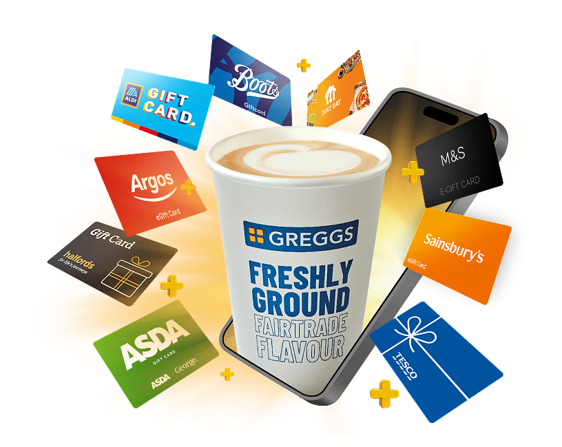
For the past 5 years, Confused.com has offered incentives to customers who purchase car, home, or van insurance. Our previous scheme gave users a choice of one of four rewards. We even introduced a monthly treat – a hot drink from Greggs – which was a hit, significantly boosting retention.
However, there was a catch… only 15% of our customers actually redeemed a reward. This meant we weren't fully leveraging the retention power of our monthly treat. We knew we could do better.
The challenge:
Within 18 months, create a new marketing proposition that would make Confused.com the go-to platform for insurance, driving a meaningful shift in acquisition, retention, and product density (customers buying more products from us).
My mission:
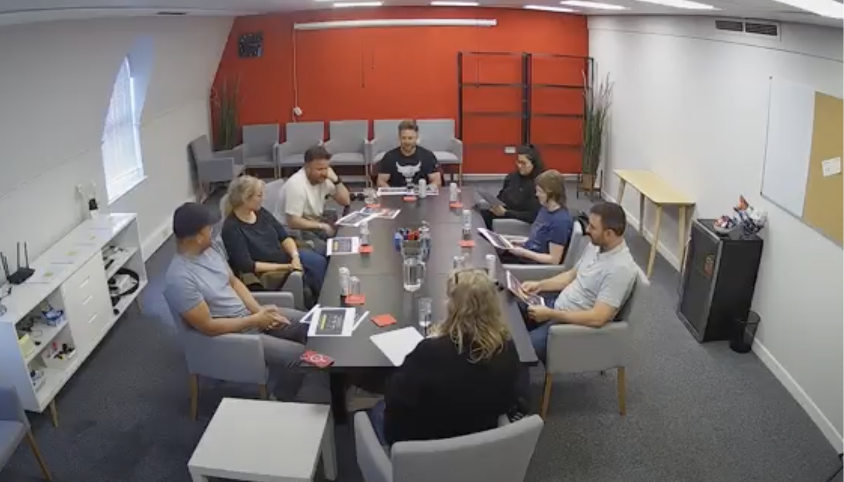
To build a strong foundation, our first step was aligning stakeholders and creating a shared understanding of where we stood.
We brought together three cross-functional squads, including marketing, product, support, developers and senior leadership. We ran a series of collaborative workshops. Each session started by grounding the group in our current state before opening up discussion around future opportunities.
Aligning with stakeholders & driving collaboration
To support this, we consolidated everything we knew. Including analysis of our current offer, past user research, customer support feedback, and a large-scale competitor review. This surfaced a few key insights:
Online redemption was frustrating, leading to user drop-offs
Complex redemption journeys were perceived as dishonest and eroded trust
Rewards often went unused, creating low perceived value
Users wanted choice and flexibility, but rarely liked the options available
Competitor analysis (34 schemes) showed that successful programmes balanced short- and long-term value, often with a sense of progression
The second half of each session was all about blue-sky thinking, taking what we knew and asking, “what could we do with this?”
We opened it up to the whole group so everyone could contribute ideas. It was important that the problem felt clear to everyone, and that different perspectives across the business had a voice in shaping potential solutions.
No idea was off limits. By the end, we’d generated over 50 unique ideas.
Early ideation

Refining the vision
To narrow down our ideas, the Product Manager and I scored each one out of 10 against four critical categories:
Does this idea deliver customer value?
Does this idea deliver business value?
Is this idea technically feasible?
Is this idea viable for our business? (Considering brand alignment and potential cost.)
This allowed us to filter out less promising ideas and highlight areas that needed further exploration.
As our discovery progressed, we continuously updated these scores based on what we learned.

Targeted discovery to shape the direction
Once we’d narrowed things down to four ideas, we moved into more focused discovery aimed at filling the gaps in what we didn’t know.
We were intentional about what we needed to learn, which made sure the research was directly feeding into how we’d design both the offer and the journey.
For the concept we progressed with, we focused on four areas:
Technical feasibility: Working with engineering to understand constraints early
Customer value: Running focus groups to explore needs and test the idea
Business value: Using surveys to validate demand at scale
Viability: Light-touch forecasting to sense-check costs
This approach helped us quickly understand what was realistic, what resonated, and where to focus. It meant that when we moved into design, we had a much clearer direction.

Testing & shaping the offer
To put our ideas in front of users, we ran three focus groups across the four shortlisted concepts. I created two branded mock-ups for each, making them feel like real offers rather than abstract ideas.
This was not just about testing appeal. It helped us understand how the offer should be presented, what resonated, and how people expected the experience to work.
One idea clearly stood out. A tiered, multi-product reward system with increasing value for repeat purchases and access to a wide range of brands.
Here’s what users responded to:
Choice: With 150+ retailers, it felt flexible. “It’s like cash.”
Progression: Increasing rewards encouraged repeat behaviour
Simplicity: “There’s no thinking involved.” It was easy to understand
It also highlighted what needed refining:
Tier confusion: Users expected tiers to offer more than just progression, such as added perks or savings


Example of the conversation stimulus shown during focus groups
Validating the offer at scale
Our quantitative research helped validate the broad appeal of the tiered offer, while also highlighting a few important concerns:
Difficulty progressing: Users worried they would not use the service enough to earn meaningful rewards
Trust issues: Some felt the offer “sounds too good to be true,” pointing to a need for clear, trustworthy communication
This stage also gave me a clearer picture before moving into wireframing. We learned how people preferred to redeem rewards, what they expected from the process, and how quick and simple it needed to feel.
All of this fed directly into the initial wireframes, helping ensure the experience was grounded in real user expectations.
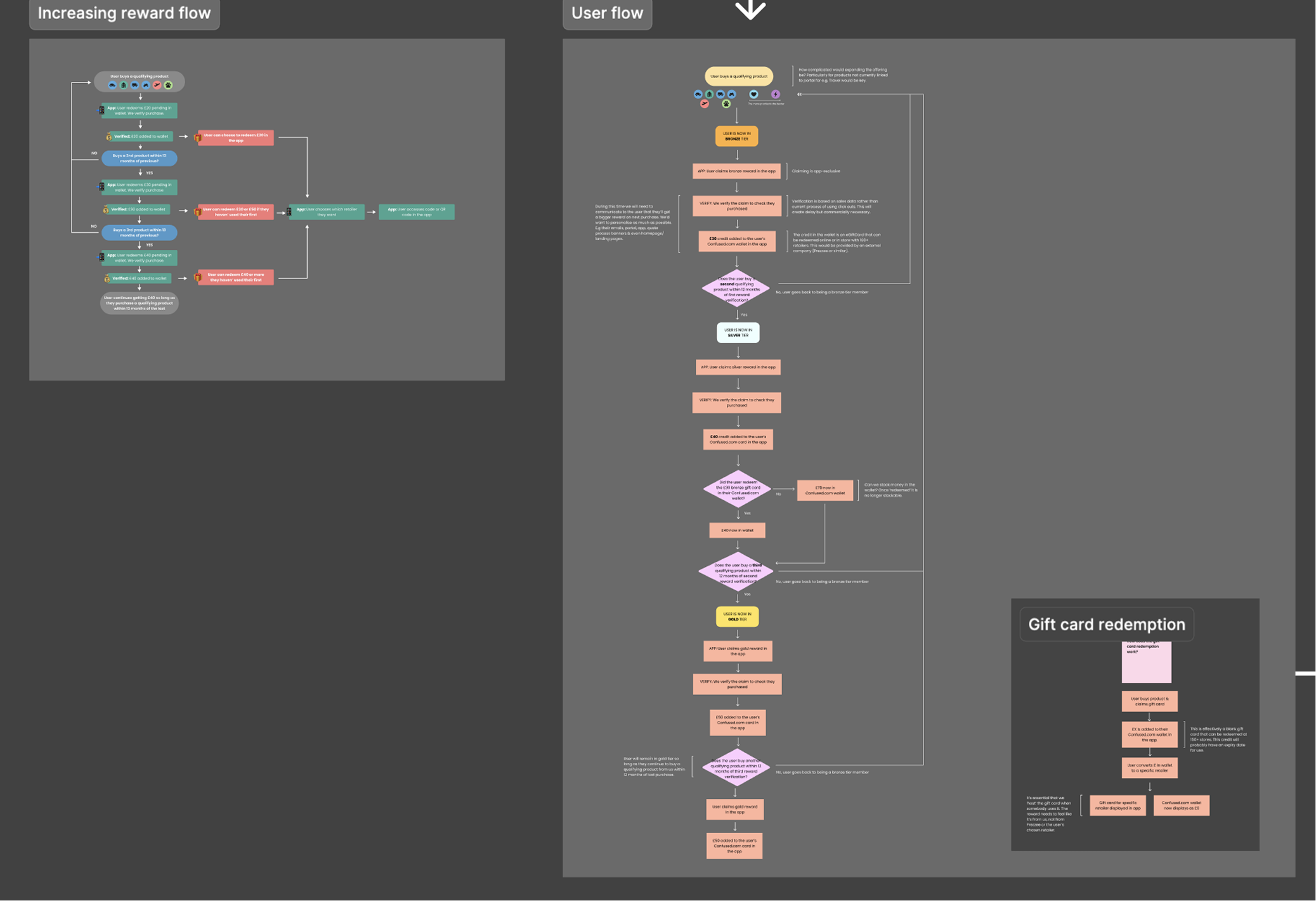
Mapping the journey & wireframing
With a clear direction in place, I moved into mapping out the end-to-end journey and creating wireframes.
As we were working with a new reward provider, it was important to align our experience with their technical setup from the start. I worked closely with engineering, our app team, and the rewards team to sense-check flows early and surface any constraints or gaps.
Usability testing & refinement
Once we had a working prototype, I tested it with 10 users through Usertesting.com, focusing specifically on the redemption journey and overall usability. Branding and marketing were intentionally deprioritised at this stage so we could focus on how the experience worked.
The sessions revealed a few key areas to improve:
Expectation of automation: Users expected rewards to be automatically applied. This led us to rethink how data was shared, removing the need for users to manually add rewards
Unclear progression: Users often missed that their next purchase would unlock a higher reward, prompting changes to better highlight progression
After testing, I refined both the designs and the user flow, smoothing out friction points and making the journey as intuitive as possible. With the structure in place, I then moved on to defining the brand and messaging.

An early dashboard wireframe we tested with users.
Branding the offer
Next, I defined the visual style of the offer. We ran multiple UserTesting.com sessions, including five-second tests, to see what was memorable across our core marketing channels. This ensured the design worked in-app and in marketing.
Research showed “tiered” had negative connotations. Users wanted simplicity and immediate value, so we focused on clarity while building on Confused.com Rewards’ existing brand. Highlighting the wide range of redemption brands was also key.
This led to Rewards+, a visual style emphasising choice, with the tagline: “Get rewards you’ll actually use, every time.” Working closely with the brand team was critical, as pitching new ideas while staying on-brand required careful collaboration.
Confused.com Rewards+
Unused branding ideas

Each idea aimed to encapsulate Confused.com’s brand ethos, the lifting feeling that comes with ticking insurance off your to-do list.
However, our research revealed that these ideas focused too much on future progression and not enough on the here and now. Users cared more about the reward they’ll get now, not what they’ll get next year.


Final designs


The results:
Our post-live survey of purchasers revealed:
63% of respondents said Rewards+ had a major impact on their decision to buy their insurance.
78% of respondents would be much more likely to compare insurance with Confused.com in future because of Rewards+.
We also learned that 40% of respondents noticed the offer while comparing quotes.
The impact on retention and acquisition:QuoQuote
Quote to sale conversion increased by +5% from launch.
Rewards+ customers' retention rate is 28% higher than our existing Reward customers, and 42% higher than users who didn't claim any reward.
Rewards+ led to a 5% increase in customers returning from non-paid channels. Many users are now redeeming rewards in our app and choosing to return to buy other products via this channel, rather than through paid search.
Product Density and Sales Frequency:
Rewards+ customers are buying more products, more frequently, with a +1.5% increase across both metrics during the test period.
The retention trend suggests that the "more you buy, more you get" element of Rewards+ is actively encouraging subsequent purchases sooner.